About this site design
Technical Design - User Experience - User Interface
This site is a home brew that has evolved over a dozen years.
Below is a bit of UX-UI ramble between case study, best practices, and notes on what I've got running now.
More recent changes and details are on the Site Log.
Note: a more professional example of my technical writing is in this web project plan, something which helped me land a job at a digital marketing agency.
Technology
- Google Cloud Platform hosting
- jQuery for easy UX niceties (many pages might not need it)
- FancyBox.js jQuery library for image effects (c.f., Lightbox)
- FitVids.js jQuery library for responsive video embeds
- Chart.js graphing library
- Smart Image Resizer for pre-scaled image cache
-
FreeFind search engine
Tools
- Google Application Engine
- Sublime Text editor
- YSlow and Web Page Test
- Xenu Link Sleuth and Firebug
- Google Analytics
- Microsoft SyncToy to promote local pages into production
Architecture
For development, there is a light-weight page controller that assembles the site from HTML content articles. It uses a battery of PHP and JS to format pages with consistent layout and UX, e.g., context-sensitive menus, navigation animation, and responsive graphics & videos.
For production, a script writes (publishes) static HTML pages. Google App Engine is then used to push those static files to the Google Cloud Platform ― free hosting for sites under 1 GB and fewer than 10K files.
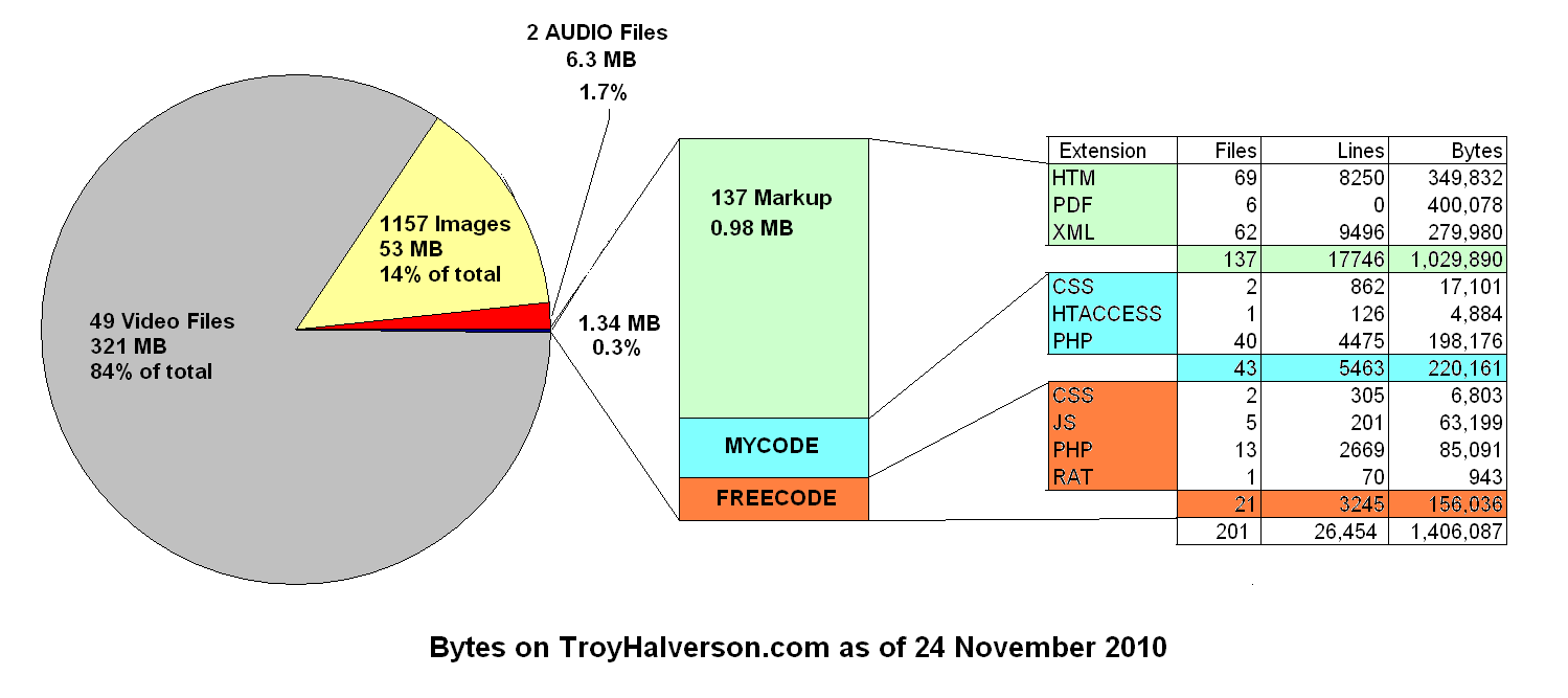
It all adds up to less than 3K lines of custom code (95% PHP, 5% Javascript), plus jQuery and a handful of tiny plugins. Desktop and mobile presentations are tweaked via media queries and 2K lines (35 KB) of CSS. There is no SQL or CMS; all the structured content (page and meta data) is in a CSV file (40 KB) that I edit with Excel. All pages validate as HTML5 as of 2014.
Future
In January 2016 the site lost adapative image support, a consequence of moving from a LAMP environment with dynamic PHP image sizing, to a free static-file host. I found the free version of Image Engine unreliable. At some point I'd like to try plugging in Cloudinary.com. Until then, the publishing process builds a cache of image sizes (320px, 640px, 1280px) and CSS loads the best fit.
To date I've been reluctant to invest time in a javascript framework; there is so much technology churn that, across all web sites, even the most popular frameworks have low single-digit market-share penetration. Keeping up with a few stand-alone popular javascript libraries seems more future-proof.
Mobile and Desktop
I made the site responsive and fluid starting in 2012 (Google Analytics showed mobile use above 15%). I added Stacked Layout, a light-weight CSS framework that switches to multiple columns based on CSS media queries. Previously the pages were designed for a fixed, compromise, resolution of 800px. Pages are now scaling well from as narrow as 320px up to about 2000px.
Fluid support includes wrapping all videos and (almost) all images with a few shared PHP functions. The functions themselves can be easily updated as better approaches come up for keeping layouts fluid across resolutions.
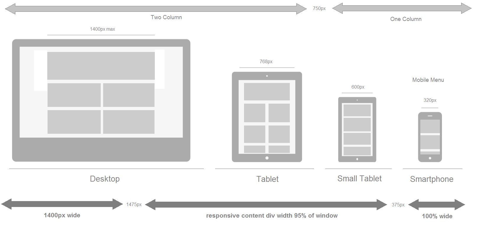
Responsive Layout Breakpoints
| Breakpoint | less than break | greater than break |
| 375px |
0.8em font Full width, no margins imgs scaled 360x240 |
1.0em font 5% margins |
| 750px |
Single column content 640px max Lightbox imgs |
Two column content 640px max Lightbox imgs |
|
1475px |
95% width content |
1400px width content max 1280px max Lightbox imgs |
Aesthetics
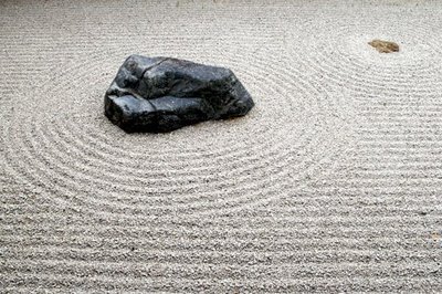
I have a simple design layout primarily to focus attention on the content. I learned to avoid superfluous decorations from reading Edward Tufte’s books on information design and from seeing ultra-simple sites like Zen Habits. Simple layouts are often the most efficient and, according to Google Research, most users simply want an uncomplicated user experience.
Desire:
- Content on every screen
- Freshest content near the top
- Most popular content near the top
- Obvious navigation and calls-to-action
Avoid:
My reaction to auto-play site intros
Home Page
I'm still experimenting here, struggling to accompish:
- A Brand Story
- Bold Drama
- Minimalism / Focus
- Emotional Tone
Avoid:
- Making the user wait
- Another click-through
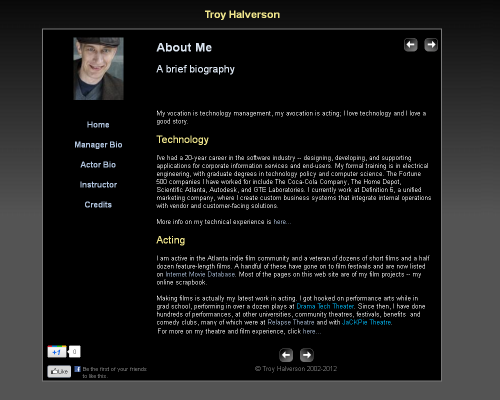
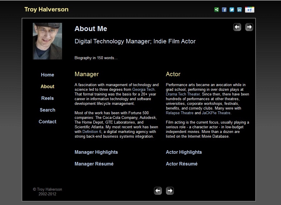
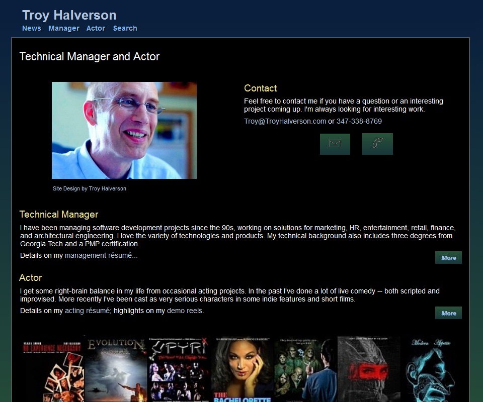
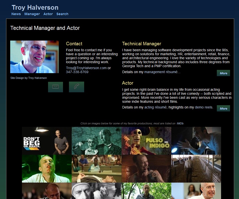
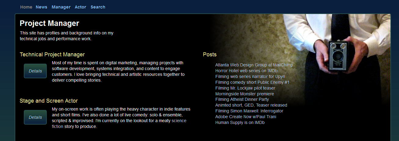
Periodically I'll randomize what content is on my home page and the monitor the results in Google Analytics. In the past I mixed it up with image carousels, rotating hero images, About bios, Contact info, a high-level sitemap or word clouds (effectively a "mega-nav"), my blog, and A-B call-to-actions that drove users to either my acting set of pages or to my technology management pages. While job hunting in 2013 I made the CTA's go to directly to résumés. Two months later I landed a job and reverted to an abbreviated "About" page with CSS3 animated movie posters. Trends and fads. About the only constant is an A/B call-to-action approach on the home page, designed to get people into either my technology management info or into my acting materials.
My pet peeve is auto-play intros: they're [almost] always annoying. There was a brief respite from their popularity as the iPhone killed Flash, but I see them rearing their annoying head again as HTML5 support grows, now in the form of auto-play full-screen videos or gamey paralax animations. Even the horrid banner ads have had a re-incarnation of sorts as some sites start with a popups to install a mobile app. Rude and telltale signs that the rest of the site is lame. At very least, they throttle back my ability to get information quickly. That's the primary use-case they are co-opting.
They can be good supporting info -- telling a brand story -- but that engagement be an optional, non-blocking element. Don't force the user to find the "Skip Intro" link. And please don't auto-play audio. Like children, web sites should be seen and not heard. The other trouble is that since they have been so over-used, many users are conditioned to ignore such elements, like a legacy-effect of banner ads our eyes try to skip the visual noise. Better I think to incorporate subtle CSS transition effects. That's a rich playground for lots of consultanting time, to create that subjective UX, and an aesthetic subjective balance, that is right for the brand. <<END OF RANT>>
Goldilocks columns
About 14 words (70-80 characters) per line looks "just right" to me. The old readability tables of Rudolf Flesch would rate that as "6th grade" reading. A range of 8 to 20 words-per-line is still reasonable as responsive layout changes from "4th grade" to "10th grade". With my two column grid, this means I cap the content div width to 1400px. On large screens I expand the side margins expand to keep lines from ever getting longer than "10th grade" length.
TO DO: add another media query to support a three-column layout on very wide screens, and pull the one-column threshhold down a bit. (alternatively, increase the font size on huge displays or switch to a grid system?)
Drama
Most of my content is related to stage and screen so the color scheme shows content on a dark background. To me it reminds me of staging a show in a black-box theatre or showing a movie in darkened cinema. It's a dramatic look that you won't see, for example, on a banking or investment site. It's not ideal because it really isn't appropriate for my corporate resume and engineering credentials. Also, most UI/UX research says dark text on a light background is generally more legible. At some point I'd like to cascade another style sheet to give my manager and academic pages a less theatrical color scheme (or move it to it's own domain).
Pallete
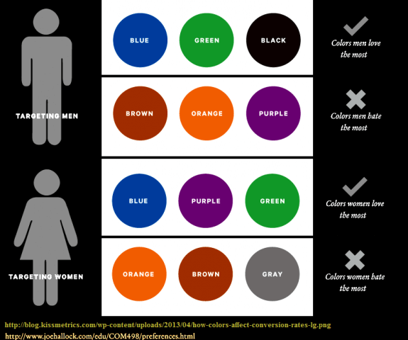
Blues and greens predominate my color scheme for purely personal reasons. Of the four cars I've owned, two were dark blue and two were green. In 2013 I came across some research that found these colors are actually the most common choices among men. Here I thought I was expressing my individually but it turns out it's probably just "a guy thing." Toss in the dramatic black I use for the text field (c.f., black tires on a car?) and my site reflects all top three colors men love the most. Click the chart to get to the study and other color preference results between genders and age groups. A bunch of more recent studies of color associations are summarized here
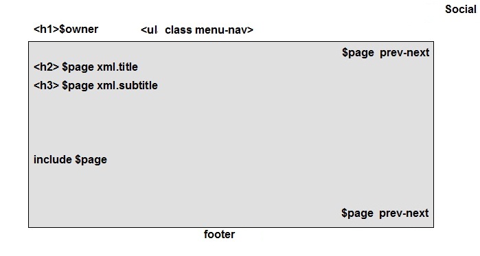
Wireframe
Generic elements:
- <H1> header label matches the vanity domain name
- Page title and sub-title use the <H2> and <H3> tag, respectively
- The browser window title is the <H1> label for Home and Search pages; all others use the page title from the <H2> header.
- Horizontal main navigation upper left, auxiliary navigation on right and bottom.
- Links for social media float in upper right, indepent of scrolling
- Boxed content body is one or two columns depending on the device resolution, and will have side gutters on wider devices.
Fluid Layout Guides
- For scalability, essentially all sizing and positioning is done in percents (%) or ems (em). Use of pixels (px) used only where necessary, as in media queries or embedded components (e.g., Flash)
- For legibility, I prefer text columns that have between 8 and 20 words per line. I tested a sample of my writing in Arial typeface and this is worked out to column width of between 24 to 46 ems.
- For displays within that range, side gutters of 2.5% display to match top and bottom gutters
- Side gutters disappear when the display it smaller than the preferred minimum column width (i.e., less than 20em, about 10 words)
- Side gutters will grow beyond 2.5% on displays that are larger than two max-width columns (roughly 85em)
- On wider devices, content should appear in multiple columns so as to 1) preserve column widths within a preferred range and 2) minimize the amount of gutter . That is, we want use the entire screen for legible content.
- Boxed content body is automatically re-sized to centered with gutters that size to maintain text columns of 10 to 20 words (roughly 20 to 40em). On small displays there will be no gutter; of typical displays, gutters are 2.5% of the width until column width hits maximum of 40em (about 20 words); then it increases to as needed to maintain the column width
- On displays < 20em, gutter is 0%
- Content displays in two columns when the column on wide displays (approv 44em)
- Except for very large displays, side gutter 0 em for small screens; 2.5% for medium screens. screens more than 88 em wide.
Performance
I have a few performance hacks specifically for graphics.
These also let me support mobile and desktop from the same HTML page:
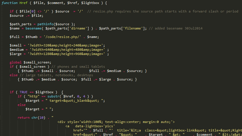
PHP functions for handling images. My pages generally use a server-side function call instead of direct <img> tages. These functions encapsulate my support for changing devices and technqiues (resolution, UX effects, browser versions) and let me make changes and improvements without ever touching HTML content pages.
Image Missing
I use resize.php function that auto-generates and caches 3 different resolutions versions from original image files. The specific sizes (320px, 640px, 1280px) map to my media query breakpints. That gets approximately right-sized chunk of data to the browser, while CSS does the final responsive image resizing.
Download of image data is deferred until after the markup download. Specifically, on DOM-ready, a javascript function loads the image data as a lazy load. This lets all the non-image data and page layout to happen first and quickly (e.g., YSlow speed scores are typically well into 90s). The big tradeoff is for users without javascript enabled as they will now mostly non-graphic experience (e.g., they either have to click on a text link to open an image, or don't see images at all).
Image Missing
As CSS3 support becomes more prevalent, I've started to add more "nice" affordances -- subtle animation and graphic effects. Some effects that required javascript or the burden of support files (background images, sprites) can now be done as simple CSS transitions or filters. Pages are lighter, easier to modify. If a browser version doesn't support a particular effect, its absence won't be noticed or the old approach can be left in place as a fallback.
In the future, if the server-side PHP processing becomes significant, I might want to "publish" flat HTML versions of these PHP-heavy pages. For now, however, the PHP performance overhead is negligible (according to tests using Web Page Test).
IMAGE COLLAGE OF EFFECTS HERE
Navigation
-
A horizontal menu bar at the top can works find for both small screens and wide screens. In the past I have had some nice layouts with left-hand vertical nav menus but they are problematic on small mobile screens, wasting precious real estate.
-
Hover and selection effects in CSS without auxilliary graphics or sprites.
- There are no transactions or modes; the only events are handled in CSS or are black-boxed inside embedded Flash objects.
-
The state of the site is determined simply by the current page. Two data structures control the navigation model:
-
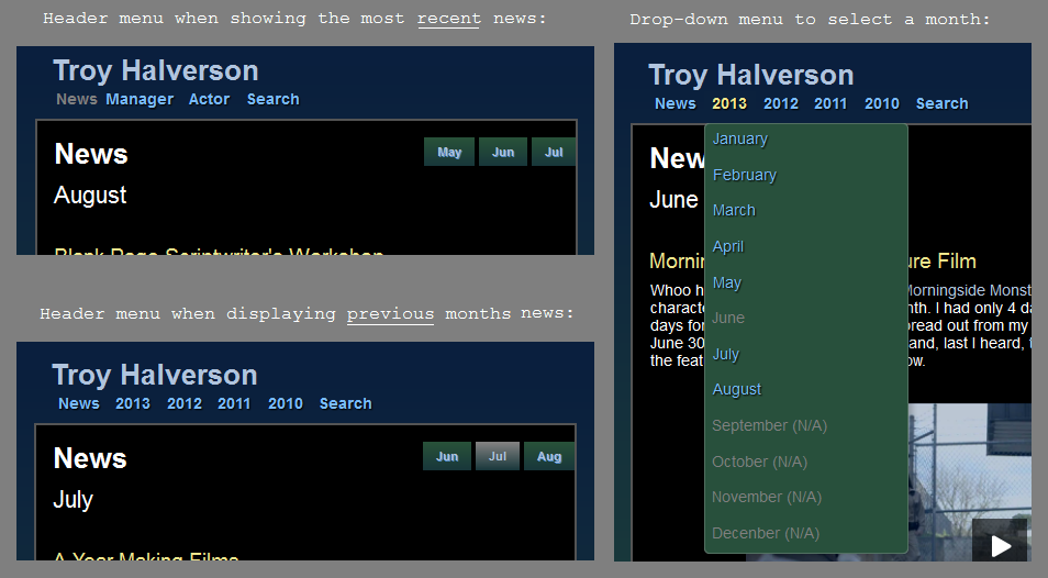
The "Previous" and "Next" navigation items are a function of the active page and a Linked List of the pages. Pages not in the list are displayed without these navigation items.
-
The set of main menu items is a function of the active page, one set for all the "manager" pages, one for "travel" pages, etc. So, each page is associated with a specific set (or gets a default set).
Wayback Machine
Some site snap shots: from humble beginnings in 2002, when the site was hosted on AOL, to more recent tweaks. It always seems to be a couple years behind the times in what's fashionable.